UX/UI CASE STUDY
A digital tool to enhance users’ access to knowledge and financial tools, empowering them to better manage their finances.
My Role
UX/UI Designer
Skills
Product design
Motion design
Interactive prototyping
User research & testing
Tools
Figma
Miro
Procreate
The Problem
00
Hard to find Information
Information that could help users is difficult to find in the the app.
Understanding the Problem
Understanding the challenges young adults face when managing finances was essential for this project. Early research revealed that many users are overwhelmed by financial jargon and lack the confidence to use available tools. To identify key opportunities for improving financial literacy, I focused on user interviews and analyzed external research and statistics on financial literacy among young adults.
User Interviews
I conducted user interviews with eight individuals aged 17 to 25 to understand their financial challenges. Many felt intimidated by complex banking terms and were scared of misinformation online, which left them uncertain about using financial tools. These insights shaped a design focused on clarity and building user confidence
Interview Methodology
-Moderated
-Semi-Structured
-Remote
Interview Results
Freelancer
"When I hear about people taking loans, it just sounds like a disaster waiting to happen. I don’t want to be one of them"
Retail Worker
"Whenever I read about money stuff, I feel like they’re talking to rich people, not to people like me"
0
0
/10
Self assessed knowledge score
0%
0%
Financial knowledge test score average
Major insights and findings
The research phase provided a clearer understanding of the financial challenges faced by young adults. It became evident that this audience struggles not just with accessing financial tools but also with understanding and trusting them.
After researching, three main insights emerged:
1
Overwhelmed by Jargon
Users often feel confused and overwhelmed by the heavy use of financial jargon in banking apps.
Opportunity
Understanding our users
Now it was time to think about who I were designing for.
Drawing from my research, my users are likely young adults at the beginnings of their financial journeys. They want simple, approachable tools that allow them to confidently navigate complex financial decisions.


Our user's perspective
Next, I needed to develop an understanding of what content and features would be most valuable to our users. I chose to write user stories because they clearly articulate user needs and how our design addresses them.
With Sarah and James in mind, I identified three key user stories to further develop:
1
“I want to trust the advice I’m getting so that I feel confident making financial decisions.”
By integrating the financial tools and guidance directly into the bank’s app, users can feel assured that the information they’re receiving is credible and reliable.
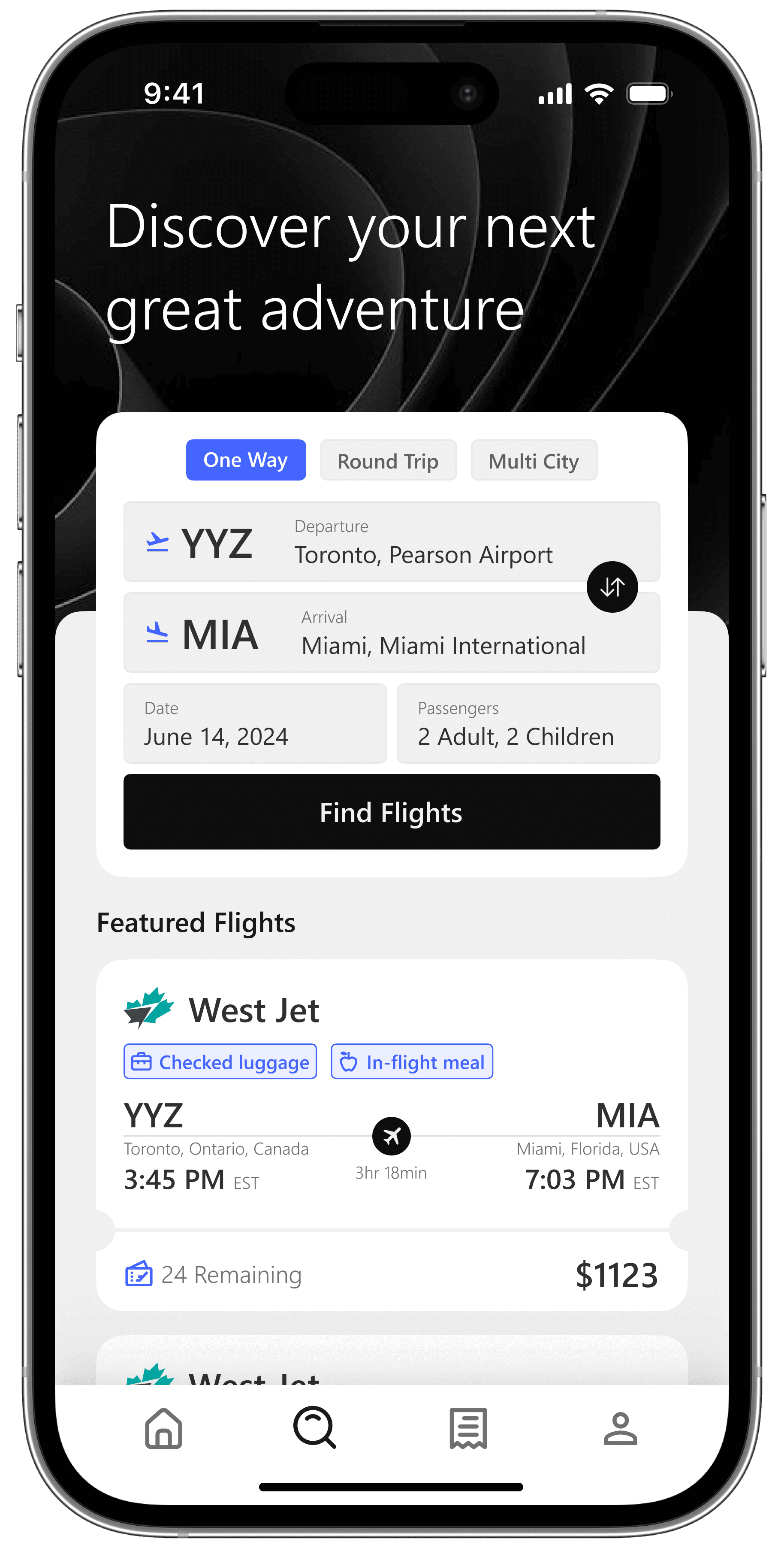
Creating the experience
Drawing inspiration from user stories, I outlined the core features during the ideation phase, creating low and mid-fidelity wireframes to efficiently structure the project before transitioning to high-fidelity designs.
I focused on three key features:
1
Personalized Learning
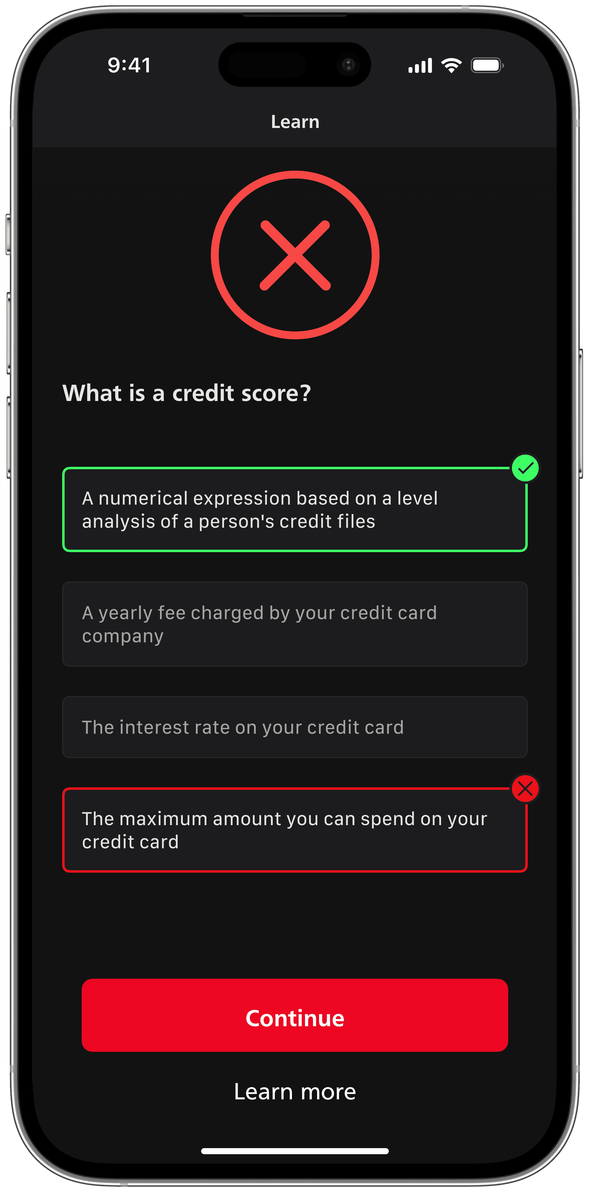
The onboarding process introduces users to the learning experience, offering a quiz to assess their financial literacy and tailor the content to their needs.
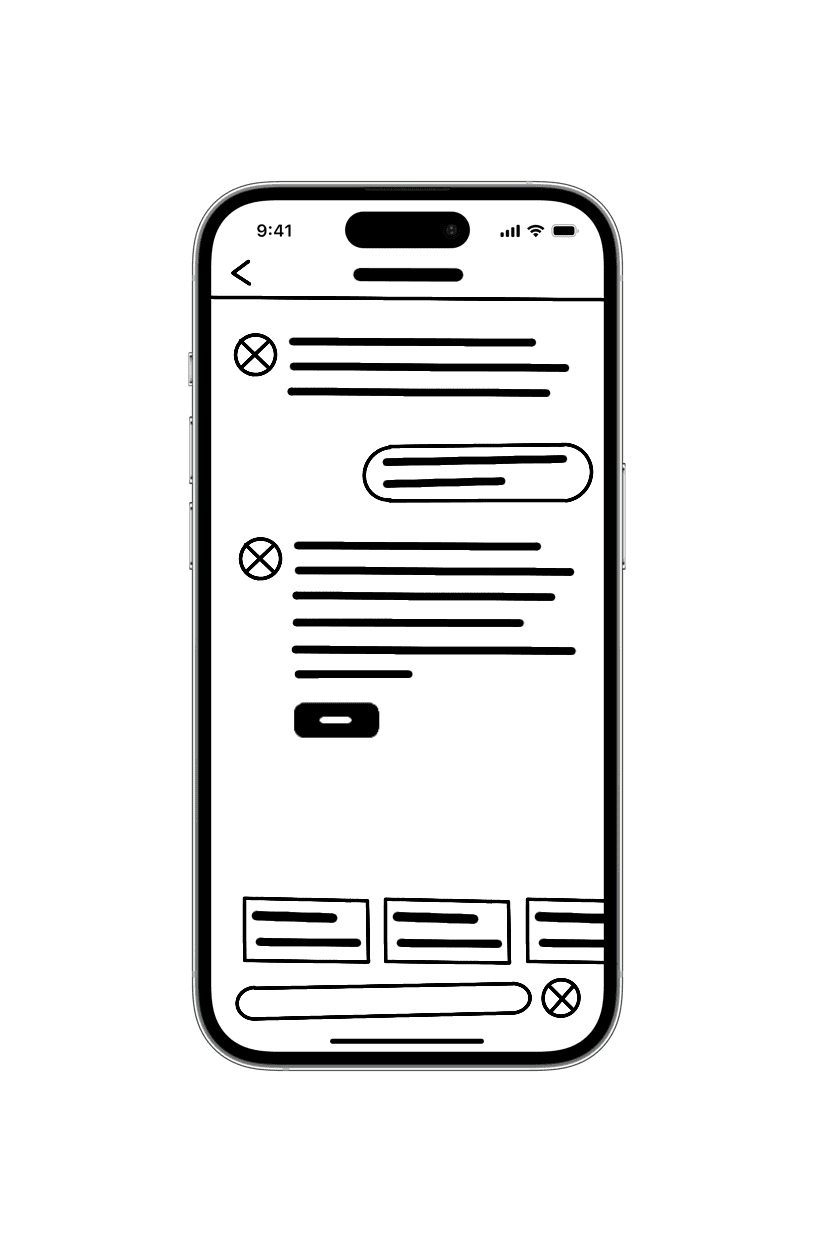
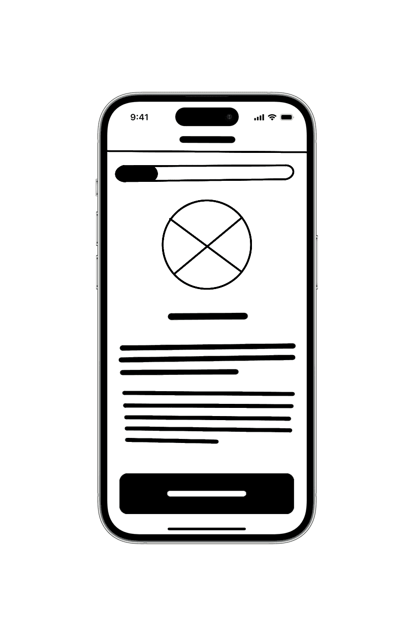
Sketching
With the core features outlined, I began translating ideas into initial layouts to visualize how users would interact with the app. Using Procreate, I sketched multiple design iterations, refining the structure and flow of the interface. Each sketch was annotated with notes to clarify functionality, just hover.


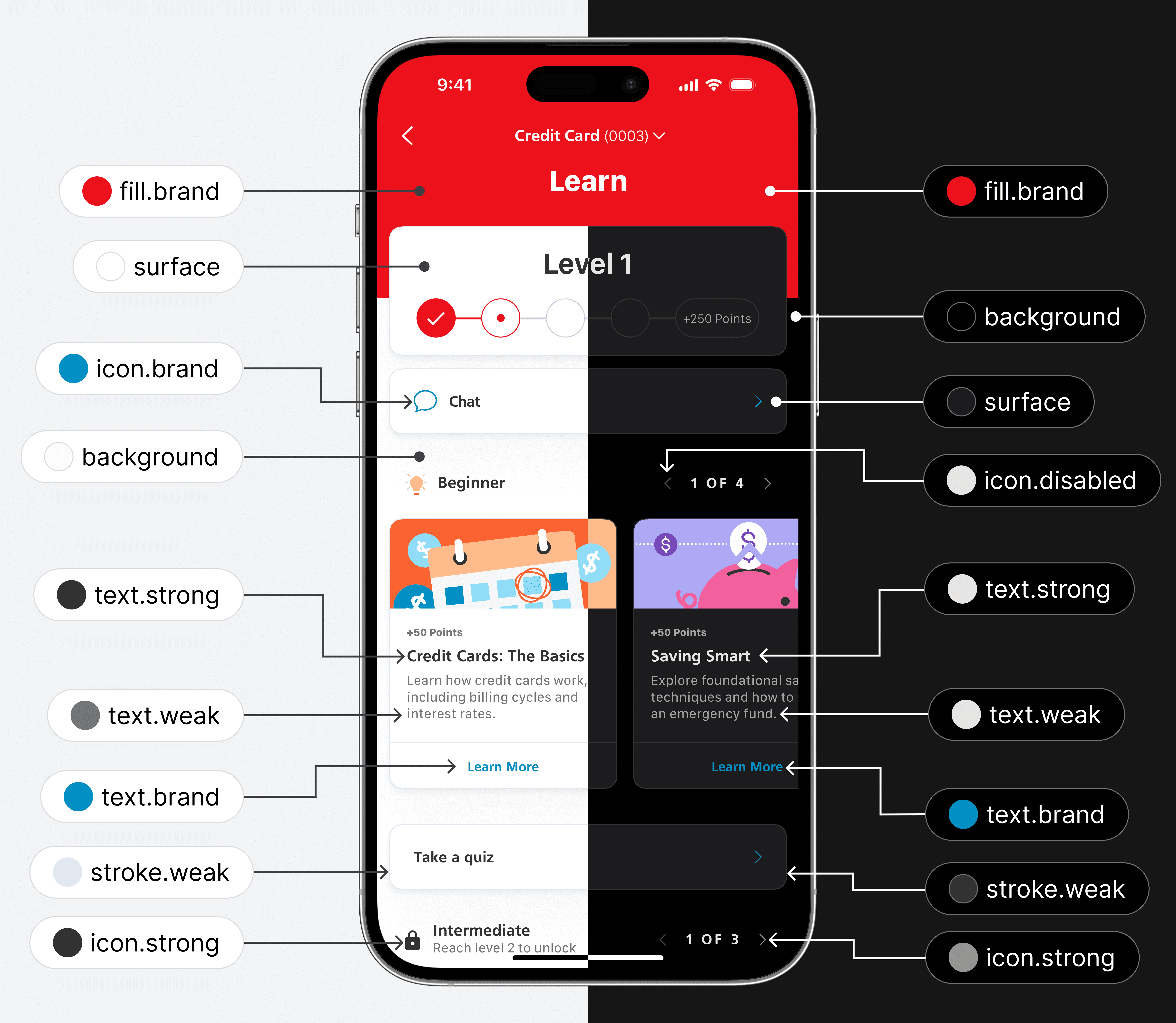
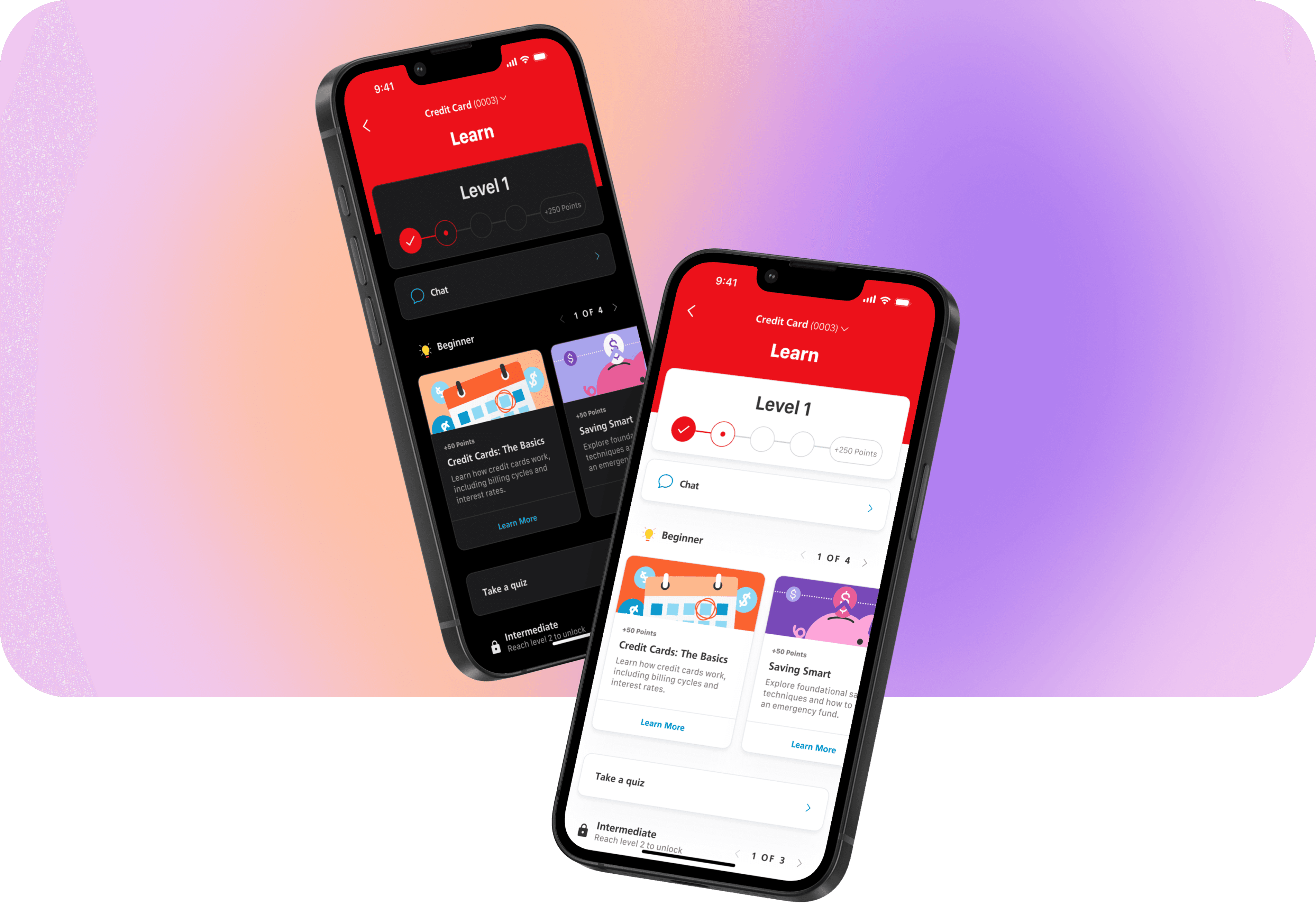
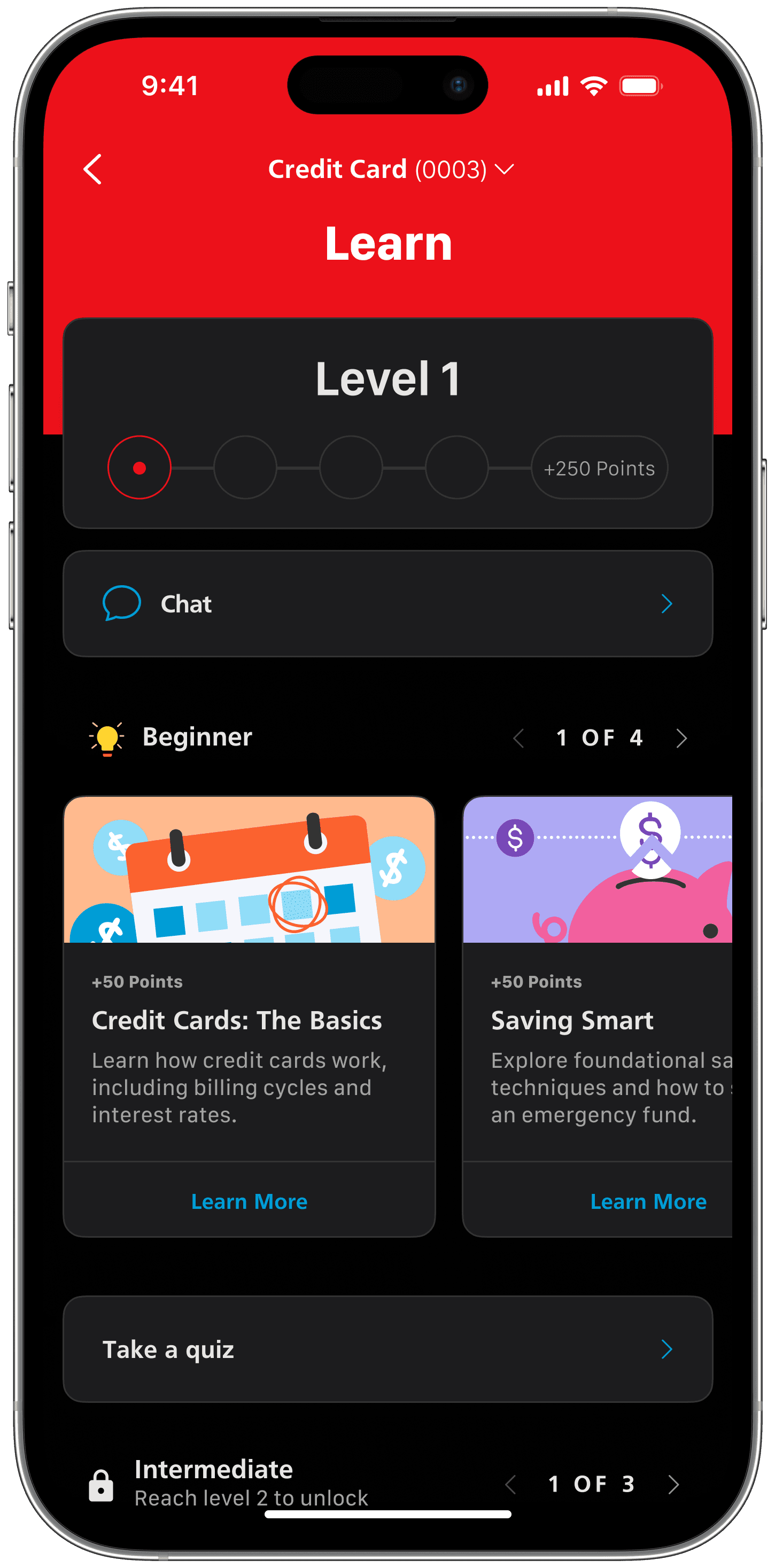
Cohesive Design
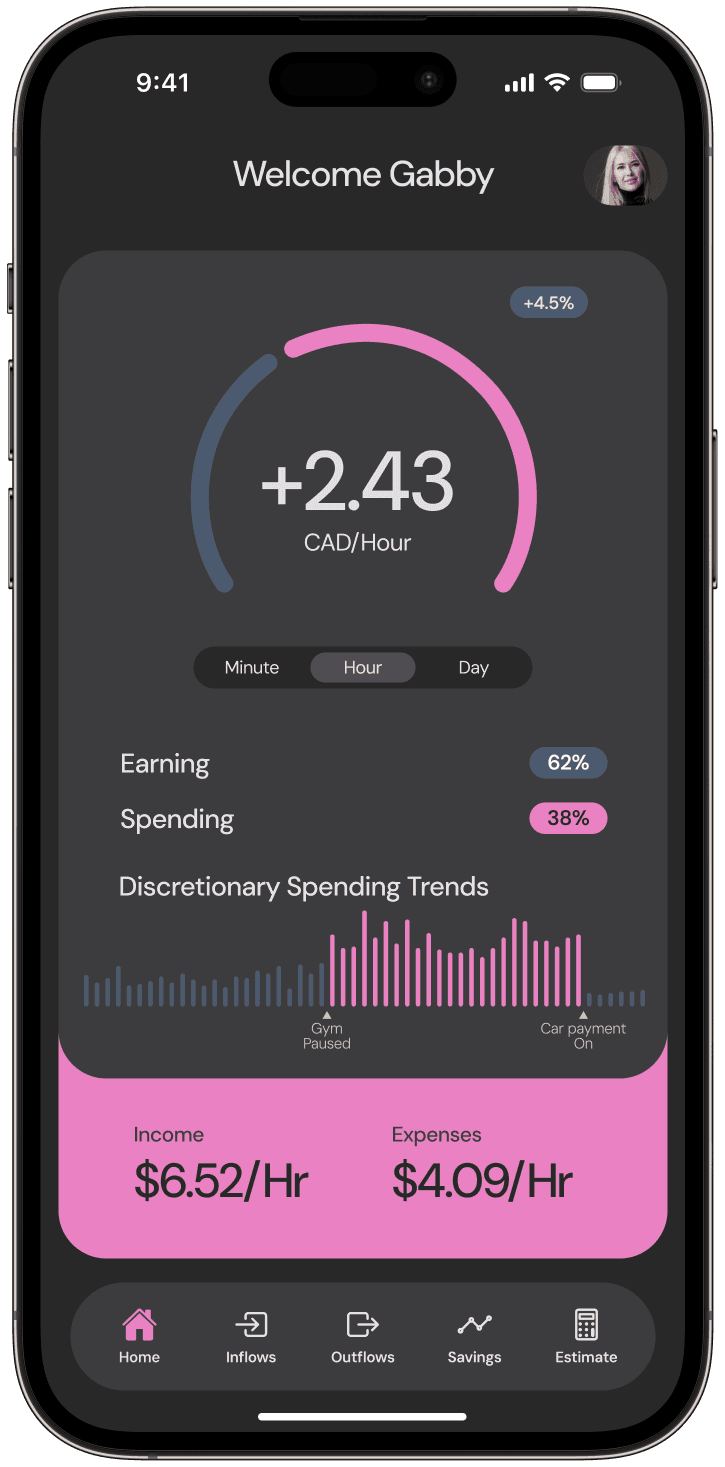
To ensure consistency, I meticulously recreated portions of the existing app to align with its style guide and maintain a seamless user experience. This process, despite the design system being private, allowed me to learn from its structure and apply those insights. The design prioritizes accessibility, meeting WCAG AA standards across both light and dark modes.
Aa
Frutiger
Lorem ipsum dolor sit amet, consectetur adipiscing elit. Cras vitae erat at lacus pulvinar condimentum. Curabitur fringilla faucibus condimentum.
$
$
Surpasses
WCAG 2.0 AA


Major insights and findings
Usability testing isn’t just about identifying problem, it’s also an opportunity to highlight what’s working well. Throughout the process, I discovered areas that needed improvement, made adjustments, and retested to ensure the solutions addressed user pain points effectively. At the same time, positive feedback reinforced the strengths of the design.
These are some of the findings:
1
Navigation Clarity
Some users found it difficult to locate the learning modules, indicating a need for improved navigation cues and clearer section labeling.
3
Quiz Placement
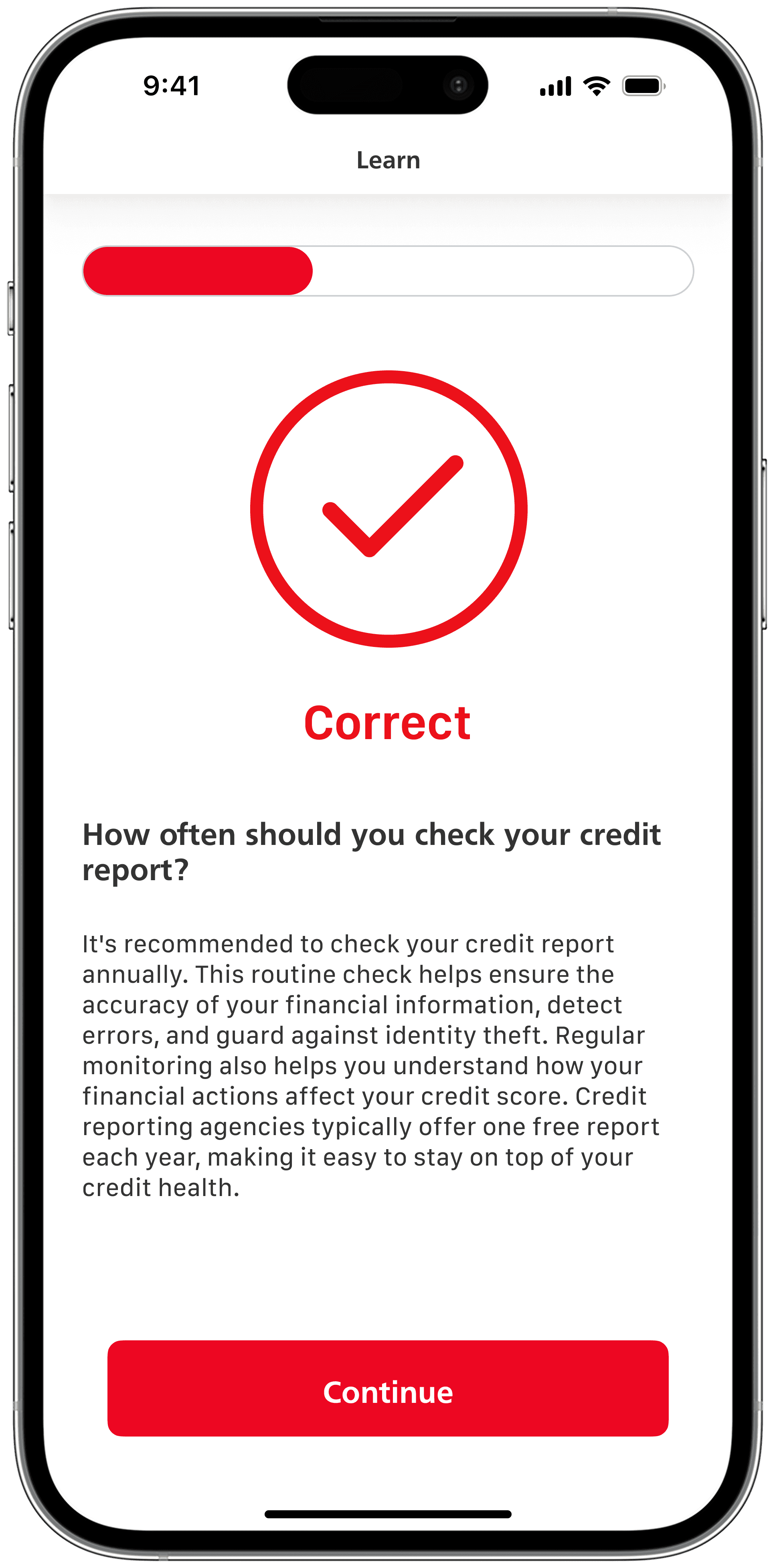
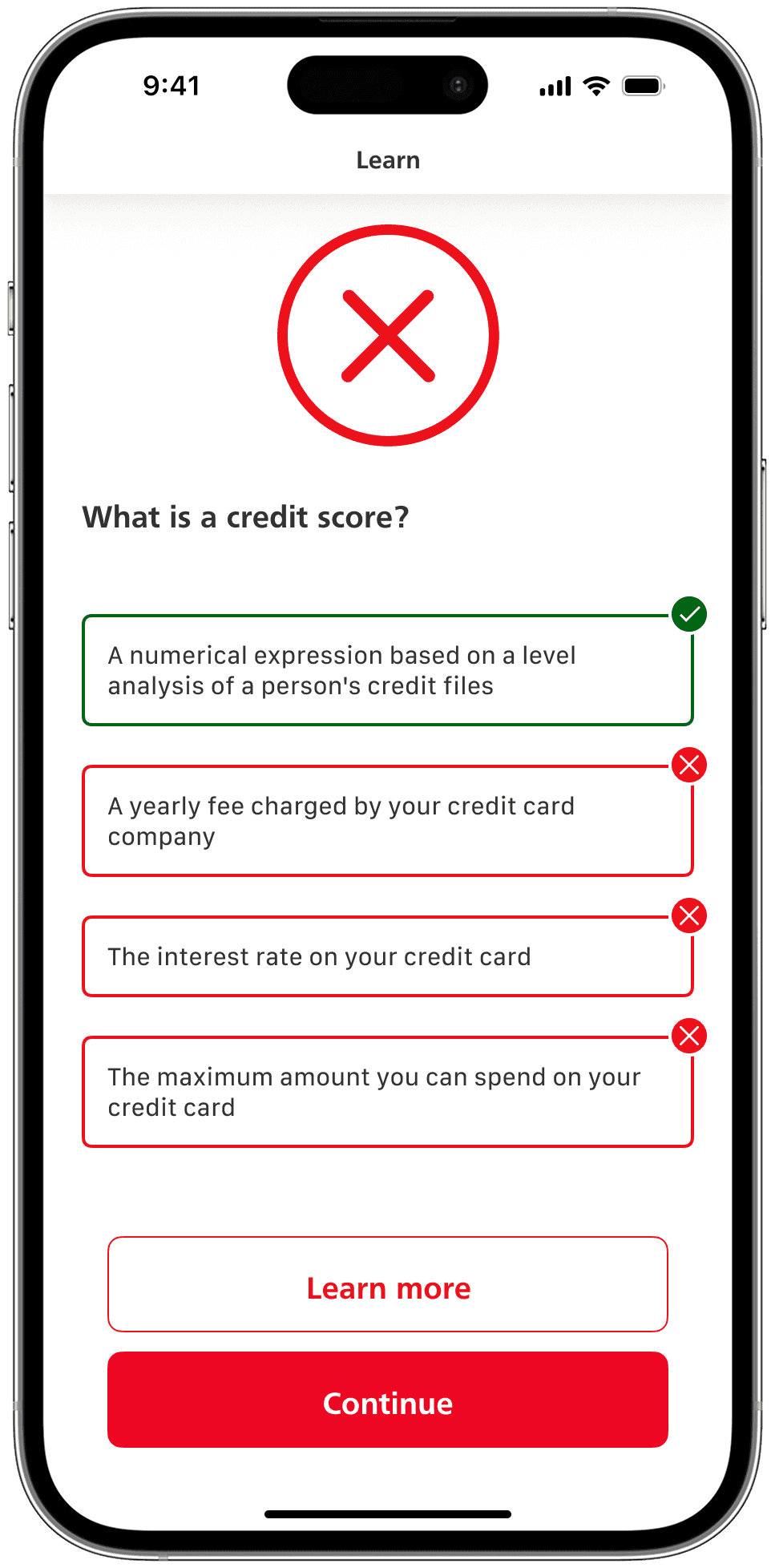
Placing the quiz immediately after the learning modules was effective in maintaining user engagement and reinforcing knowledge retention.

What comes next?
Building on this foundation, the next step is to expand beyond credit cards to include tools for lines of credit and investment accounts, broadening financial literacy resources and empowering users to make informed decisions across their financial journey.
Final thoughts
2
Research fuels good design
Strong designs are built on solid research. This project underscored how thorough research can uncover user pain points, guiding feature development to address real needs. It proved valuable both during the initial problem-finding and defining phases and later when iterating on feedback from usability testing.