
Background
This case study originated from a UX/UI bootcamp at the University of Toronto, where the objective was to design an app that addresses a daily user need, utilizing the double diamond design thinking process. This approach emphasized the iterative and often nonlinear nature of design thinking, challenging the misconception that the process is straightforward.
The Problem
The Solution
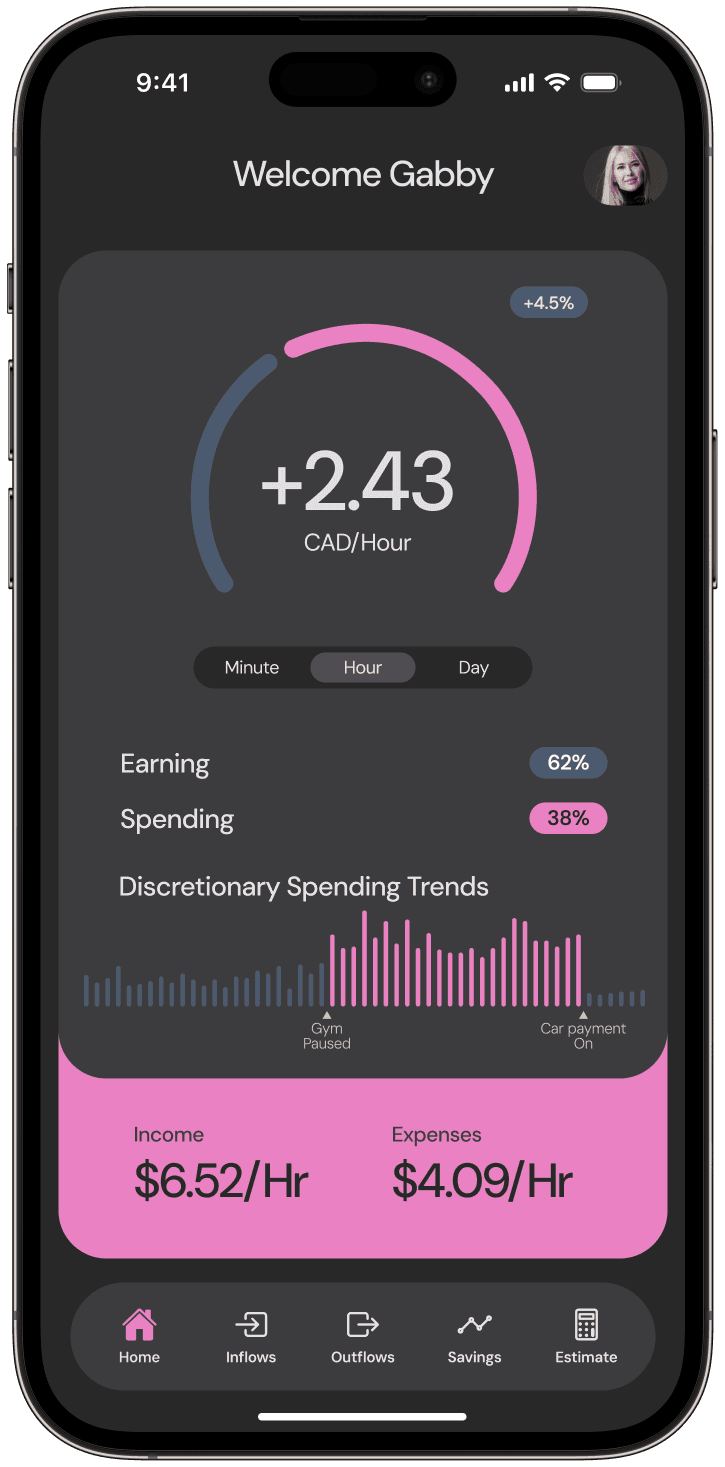
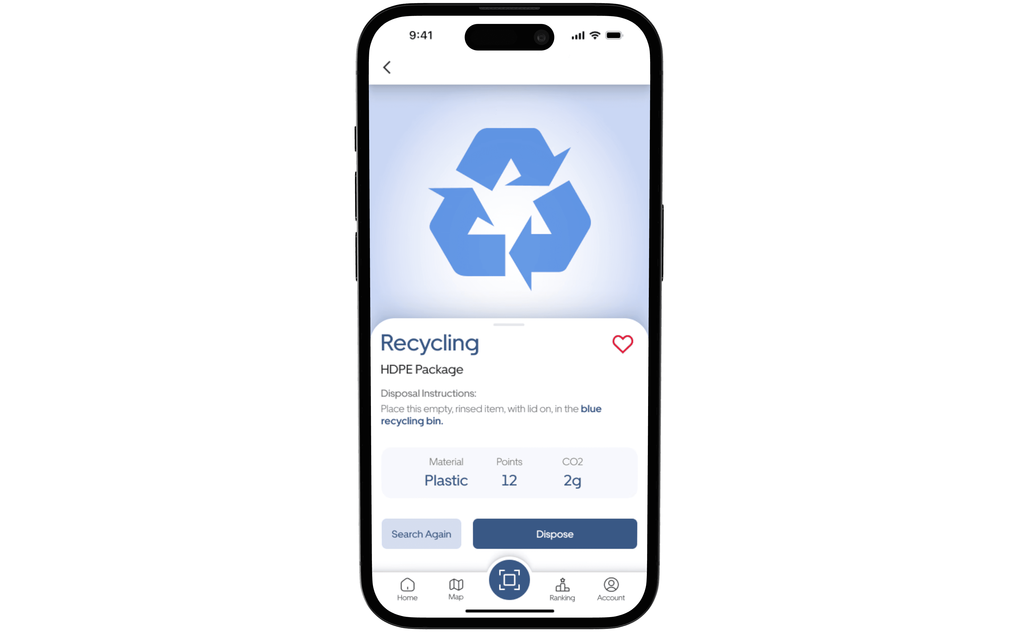
Our solution leverages advancements in computer vision technology to swiftly and accurately identify waste materials. By cross-referencing the identified material type and its condition with local sorting regulations, our app provides users with clear, concise instructions for proper waste disposal. Additionally, to encourage ongoing engagement and reinforce sustainable habits, users earn points for correctly sorting waste, which can lead to further learning opportunities and help establish long-term eco-friendly routines.
Duration
Role
Collaborators
Tools


User Interviews
Our research kicked off with crafting user interview questions, diving deep into user problems and insights. We set strategic goals and objectives shape our questions, creating a robust mix of primary and secondary questions. This approach allowed us to extract detailed user experiences and feedback, enriching our UX design process with actionable insights and aligning our efforts with the core objectives of enhancing user engagement and satisfaction.
Goal
to uncover the specific recycling challenges and needs of potential users, enabling us to tailor our app's features for maximum effectiveness and engagement. We aim to identify knowledge gaps and motivational drivers to craft an experience that simplifies recycling and fosters long-term environmental sustainability.
Objectives
Objective 1: To identify the most common recycling challenges and pain points users face in their daily lives.
Objective 2: To understand users' current habits and knowledge levels regarding waste sorting and recycling.
Objective 3: To gather feedback on desired features and improvements for the app to better support sustainable waste management practices.
Objective 4: To explore users' attitudes and motivations towards recycling and environmental conservation, aiming to enhance user engagement and retention.
User Interview Findings
Following the user interviews, we embarked on a comprehensive analysis of the responses, synthesizing the data to uncover key insights. Our top research outcomes, detailed below, shed light on user needs, pain points, and behaviours. These insights are crucial in informing our UX strategy, driving design decisions that enhance usability, engagement, and overall user satisfaction.
These are our top findings from user interviews:
Users showed interest in the app's potential integration with local waste management services, such as reminders for waste collection days and locating recycling centers, pointing to a demand for a more holistic waste management solution.
Research identified common misconceptions about recycling, such as confusion over recyclable materials and the belief that all plastics are recyclable. This highlights the need for clear, accurate information to dispel myths and educate users properly.
Users indicated that learning about the environmental impact of their recycling habits would motivate them to recycle more diligently, suggesting that integrating educational features could enhance user engagement and promote sustainable practices.
Users were interested in features that allow them to track and visualize their personal contribution to sustainability efforts, such as carbon footprint reduction over time, indicating a trend towards quantifiable environmental impact.
Many users lacked detailed knowledge about what can be recycled, particularly for items like electronics and hazardous materials, highlighting the importance of including comprehensive educational content within the app.
There was interest in features that foster community engagement, such as challenges, leaderboards, and social sharing options, indicating that users value connectivity and competition as motivational tools for better recycling practices.
Affinity Diagram
During the development of Recyclopath, the affinity map was instrumental in structuring extensive user research data to reveal patterns and insights, guiding our design choices. By categorizing user observations, challenges, and behaviors into 13 distinct groups, this visual methodology facilitated a comprehensive understanding of user needs. The affinity map not only streamlined our insight gathering but also highlighted critical areas for deeper investigation, ensuring our design strategy remained firmly user-focused and aimed at uncovering the core issues.

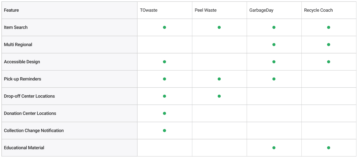
Competition Analysis
Using our understand of users problems we started to look at apps already on the market using a competion analysis this strategic assessment enabled us to spotlight deficiencies in current apps, grasp industry benchmarks, and identify opportunities. By examining key competitors, we extracted critical data on their features, user engagement, and market dynamics. This informed our strategy, steering us towards crafting an app that not only fills market gaps but sets a new standard in waste sorting technology. Our analysis was structured in two phases: an initial overview of basic competitor information followed by an in-depth feature comparison, ensuring a thorough understanding of where Recyclopath could carve its niche.
Problem Statment
We condensed our research into a clear problem statement, pinpointing the exact issue our project addresses. This statement became our project’s foundation, guiding our focus and ensuring that all development efforts targeted the identified challenge effectively, leading to a solution that meets our users' core needs.
Despite growing awareness of environmental issues, many individuals still find recycling complex and confusing due to varying local regulations and the difficulty in identifying recyclable materials. This complexity leads to low recycling rates and improper waste disposal, significantly impacting environmental sustainability. Our app seeks to address this problem by providing an intuitive, informative platform that simplifies recycling for users across different regions, thereby improving recycling habits and contributing to a more sustainable planet.
User Persona
Based on our research, we developed a user persona to represent the ideal user for our app. This persona is not just a fictional character but a detailed archetype crafted from our accumulated data and insights. It embodies the behaviors, preferences, and needs of our target audience, providing a tangible reference point for designing and testing our app. By envisioning the perfect user, we were able to tailor our features, user interface, and overall experience to meet the specific expectations and requirements of our intended user base. This persona became a tool in our development process, ensuring that our design decisions were aligned with the user's perspective and enhancing the app's relevance and appeal to our target demographic.

How Might We Questions
To kickstart our ideation phase, we made 'How might we' questions, derived directly from our core research problem. These questions aimed to breakdown the larger issue into manageable sub-problems, prompting us to consider various angles and potential solutions. This approach not only structured our brainstorming sessions but also ensured that each proposed solution was directly tied to addressing users problems from the research process. As a result, our 'How might we' questions served as a navigational tool, steering our creative thinking towards targeted solutions that would effectively resolve the identified challenges.
HMW simplify the recycling process to encourage more users to participate in sustainable waste management practices?
HMW provide personalized recycling information based on users' locations to increase the accuracy and relevance of our guidance?
HMW integrate community features into the app to foster a sense of collective action and support among users?
HMW facilitate the disposal of difficult items, such as electronics and hazardous materials, to ensure they're recycled properly?
HMW leverage augmented reality or image recognition technology to make sorting waste faster and more accurate?
HMW design our app to be accessible to users of all ages and abilities, ensuring everyone can contribute to environmental conservation efforts?
Feature Priority Matrix
Using insights from our research and "how might we" questions, we conducted an "I like, I wish, what if" exercise to generate a broad range of feature ideas. These concepts were then mapped onto a feature priority matrix, allowing us to evaluate the potential impact and complexity of each feature visually. This approach facilitated the streamlining of features, either by elimination or merging, enabling us to focus on refining the functionality and design of both major and minor features and how they connect within the app.

User Journey Map
We created a user journey map to gain a comprehensive overview of the experiences and expectations we aimed to design for. This tool was instrumental in aligning the team’s efforts, ensuring that individual components contributed cohesively to the overarching user experience. By visualizing the user's path through the app life cycle, we could identify potential pain points and opportunities, facilitating a more integrated and thoughtful design process.

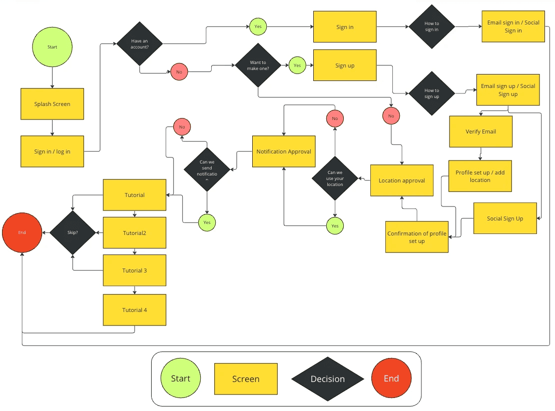
User Flow
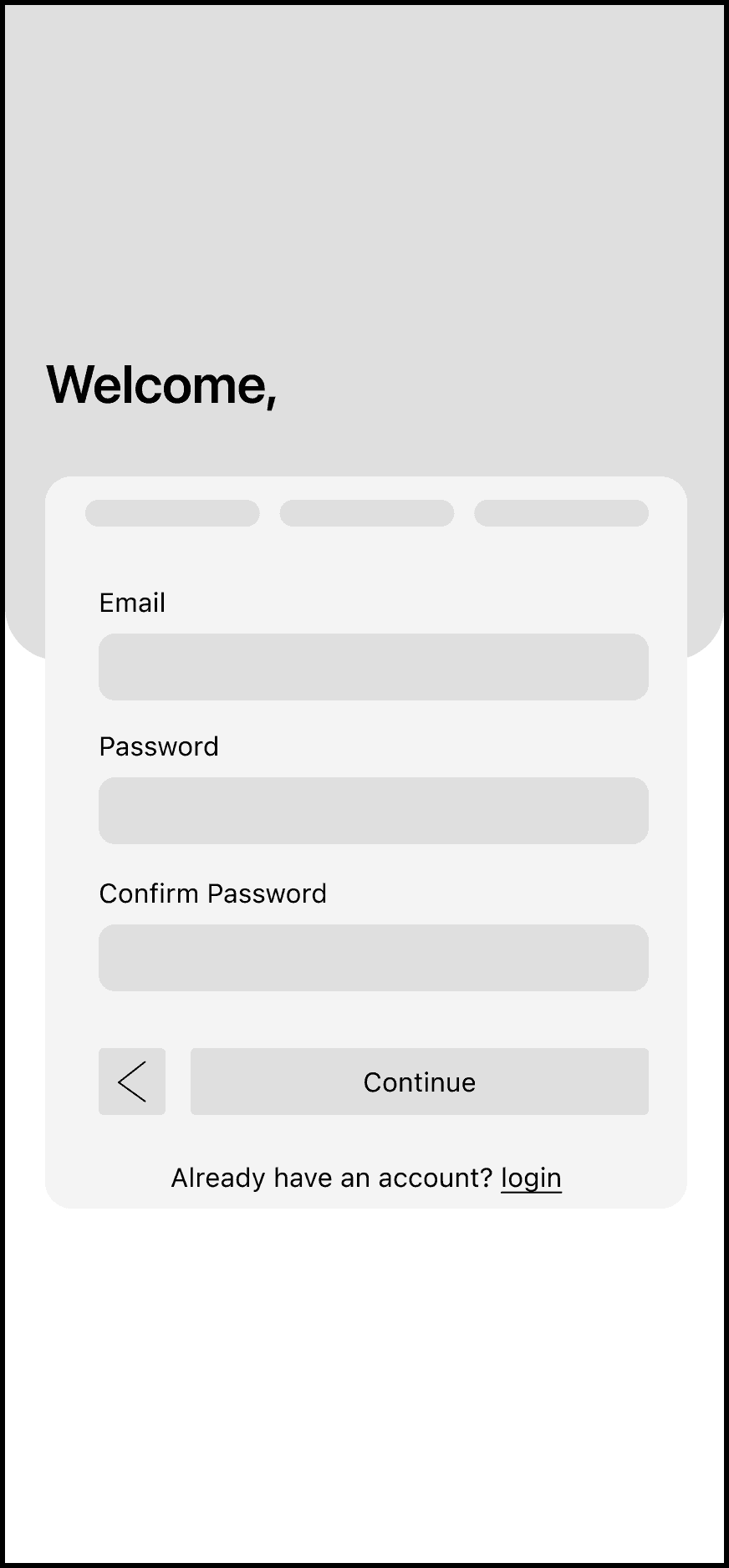
We developed comprehensive user flows for various app functionalities, serving as blueprints for the envisioned interactions and screens required. These flows meticulously outlined the necessary navigational controls for each screen, ensuring a smooth user journey throughout the app. Below is the original user flow for our onboarding process, highlighting the strategic planning behind user navigation and engagement.
Sketches
We initiated our user interface design process by sketching, drawing inspiration from various sources within the Figma community and online. By sketching different forms and layouts, we rapidly explored and refined our concepts. This iterative sketching phase allowed us to quickly evolve our designs, adapting to insights and feedback. Below is a selection of final sketches, which were pivotal in developing the low-fidelity wireframes.


Wireframes
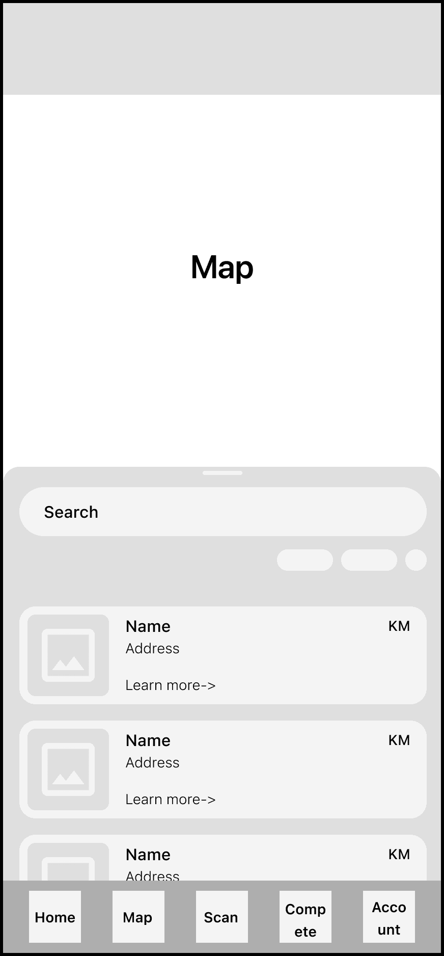
Building on our initial sketches, we created detailed wireframes in Figma to refine the user flow and facilitate ongoing testing and iteration. These wireframes provided a clearer insight into the structure and hierarchy of the design, enhancing our understanding of how users would interact with the app. Below, I have highlighted a selection of wireframe screens that were instrumental in shaping the final prototype.


Test
We initiated our usability testing by defining specific tasks that aligned with our objectives, conducting these tests with six users. After every two sessions, we made iterative improvements based on the issues and feedback identified, progressively enhancing the app's user-friendliness and seamless operation.
THE TASKS
Participants were asked to follow this task list:
1. Create a new account using email.
2. Use the waste scanning feature.
3. Locate nearest drop-off location.
4. Find user stats in community dashboard.
TEST GOALS
• Identify the pain-points of the app’s features and task flow.
• Gather feedback ranging from user’s navigation through the app to ease of the application’s process to search and book services.
• Observe how the user flows through the app to find events and other users.
• Discover what interests the user about the app. (i.e., visuals, tasks, flow, etc.)
Results
We evaluated our usability tests by scoring task completion rates, conducting tests in three rounds to refine the app iteratively. To account for varying tech savviness, we began with tech-savvy users and ended with less tech-savvy ones, ensuring improvements were due to design changes, not user ability. This method revealed a clear trend: as we decreased tech savviness, usability scores improved, indicating our app became more intuitive and user-friendly across all tech levels. The data below shows this positive trajectory, highlighting our successful iteration process.

A/B Tests
During our user testing phase, we conducted A/B tests to determine the preferred design elements among users. Participants were briefly shown two distinct design options, after which they selected their favorite. This feedback informed our decision-making, leading us to incorporate the more popular design into our final product. Below, we present samples from our A/B testing sessions.
Option 1

Option 2

Option 1

Option 2
Eye Tracking Tests
Following feedback from our usability tests, we conducted eye-tracking studies to pinpoint where users were focusing their attention, ensuring it aligned with key elements of our interface. These tests were largely successful in validating our design approach. However, they also revealed areas for improvement, such as the navigation control below. Initially, users' attention was divided between the content and an overly complex navigation button. Recognizing this, we simplified the navigation to a more familiar and less distracting design, allowing users to concentrate more effectively on the content.
Before
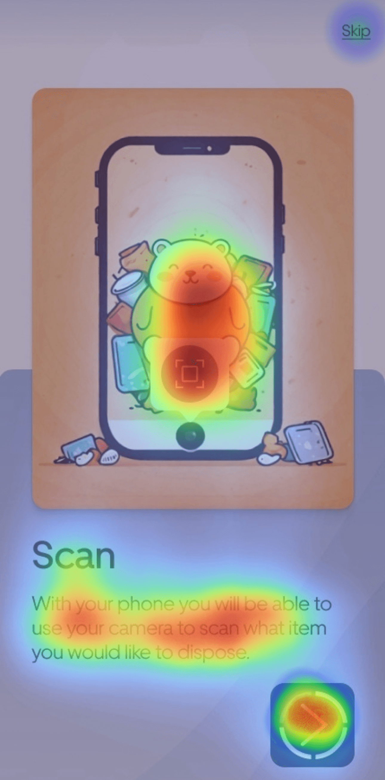
After

Design Process
My design approach is rooted in the dynamic expand-and-contract nature of the double diamond design thinking method. While this case study presents a seemingly linear progression for clarity, my actual design process fluctuates between linear and iterative phases, embodying an agile methodology. A significant emphasis on usability testing in this project underscored this fluidity, as each new insight often prompted a return to the initial stages, reevaluating and refining the entire design approach. This iterative cycle, essential for achieving a user-centered design, ensures that the final product offers a seamless user experience and effortless navigation, as depicted in the looping diagram below, highlighting our continuous commitment to refining and improving based on user feedback.

Learning
This project served as an excellent learning journey, where I delved into the complex yet fascinating realm of waste management, a crucial, yet often underestimated aspect of combating climate change. Creating this case study allowed me to enhance my team collaboration skills, navigating through both rewarding and challenging experiences. From the outset, my goal was to refine my proficiency in usability testing, overcoming previous hurdles and exploring innovative technologies to enhance our prototype. A highlight was my first encounter with user eye-tracking tests; using this technology provided profound insights into optimizing the app’s user-centricity, navigability, and simplicity. This experience has been immensely educational, equipping me with skills and knowledge I plan to integrate into future projects, further enriching my UX design expertise.